My use of media technologies in this project has ranged from using digital cameras to complicated video editing software to troubleshoot a wide variety of technical problems and I have learnt much about editing software, slide-show making software, animation software and equipment like the larger DV videocameras and use of hard lighting with the lamps.
During my research and production, I used the website www.polldaddy.com to gain feedback when canvassing our film concept and have used www.blogger.com to post the various stages of our project. I used Slideshare to illustrate various elements of production and create an animatic storyboard to preview how we intended our film to look, and Youtube to broadcast our final product to gain audience feedback, and Facebook to advertise this to my peers, aiding the evaluation process.
From relearning how best to use a digital stills camera for the type of high key shots we needed for the film poster to learning setting up the stands, poles and white sheet backdrop to reflect light and easily edit the images, learning to use the high-wattage photography lamps to control light for various effects was one of the most useful skills I learnt with technology. Using the Photoshop to create our sub-tasks was an enjoyable and fruitful process for us, as we had used the software before and using layers and the many effects and adjustment possibilities Photoshop offers,
Using the videocameras was an enlightening process as we discovered which were the best settings and effects to capture the type of look we needed on our film, and editing three hours worth of footage and retakes into a short film was where I became proficient in using Final Cut Pro. Initially we had to upload the footage using iMovie as the Final Cut software was not functioning correctly. Final Cut did have its many limitations and problematic obstacles but we overcame these by using iMove to resolve these then reimporting back into Final Cut. Many problems we came across like difficulty in hearing the sound and needing to disguise the daylight through the windows were resolved using Final Cut's blue-green eliminator, as well as dubbing the audio from other takes over a few of Jim's lines as the best take visually was ruined with too much restaurant ambient noise interfering with the dialogue. What seemed like unfixable issues we learnt to rectify with editing software, however in importing then reimporting and converting the file between the two softwares we did compromise some of the quality noticeably.
Our use of garageband in recording the narrative voice-over of our film was crucial as the poor quality microphone picked up too much breath, "p's" and "s's", and garageband had certain effects and programs we could use to disguise flaws and improve the quality to aid the overall success of our film. Finally, our use of the in built webcams on the mac computers we were using were especially useful in gathering multimedia footage of audience feedback.
The issues I had with blogger when posting the project's process were very frustrating as it was difficult to see the progression of the task chronologically, as it would display the posts backwards from the most recent and divide them into monthly sections. Also its very basic limitations on how we could display our work, i.e image size and it's complicated and way of formatting the layout made me find I spent more time trying to get the blog look coherent and presentable than I would have liked, and prefer iWeb or even Livejournal.com to blogger. However, it was accessible and convenient to use at home, so we learnt to use it as effectively as possible and put up with any issues.
Friday, 7 January 2011


Evaluation - part 3
Hello, my name is Emily Atkinson and I am undertaking a film project for my Advanced Portfolio Media coursework alongside my classmate Hannah Duncan. Our project was to create a film supported by two secondary products, a film poster and a magazine review of the film. If you could give me some feedback on our products for my evaluation it would be much appreciated. Please circle each appropriate answer and respond to each question to the best of your ability. Thank you!
1) Age:
Under 18
18 - 29
30 - 44
45 +
2) Gender:
Male
Female
Prefer not to say
3) Was “The Lover Who Lied” a good and appropriate title for the film?
Yes, definitely Average Poor Terrible
4) Did you think “The Lover Who Lied” was a successful student film?
Very successful Good Average Poor Terrible
5) Was “The Lover Who Lied” recognisable in our intended era of 1940’s America?
Yes No Maybe
6) Was the film stylistically successful in black and white or do you think it would have been better in colour? Please support your answer.
Black and white Colour
____________________________________________________________________
7) Do you think our film was a successful tribute to the genre of film noir in terms of following codes and convention? If not, please state why.
Yes No
____________________________________________________________________
8) Do you think that “The Lover Who Lied” worked as a noir short film? If not please state why.
Yes No
____________________________________________________________________
9) Did the film make sense to the audience? If not, please state why.
Yes No
____________________________________________________________________
10) Was the film engaging? Please support your answer.
Very engaging Okay Boring Terrible
____________________________________________________________________
11) Did we cast our characters well?
Yes No
12) Did we effectively create meaning using various media devices? Please answer for the following elements yes or no.
Yes No Mise-en-scene (costumes, props)
Yes No Body language
Yes No Camera work
Yes No Dialogue
Yes No Lighting
Yes No Editing (fades and cross-cutting)
13) Please rate the quality of our work in “The Lover Who Lied” regarding the following elements out of 5, 5 for successful and 1 being terrible.
__Camera work
__Lighting
__Costume
__Props
__Set design
__Editing
__Continuity
__Script
__Sound quality
__Choice of music
__Titles/credits
14) What were the most successful aspects of our film for you?
________________________________________________________________________________________________________________________________________
15) What were the least successful aspects of our film?
________________________________________________________________________________________________________________________________________
16) Would you watch a film like “The Lover Who Lied” again, for example a remade version or a sequel?
Yes No Maybe
17) Did our three products cohere well regarding:-
Colour scheme? Yes No Maybe
Visual style/use of image? Yes No Maybe
Typefaces? Yes No Maybe
Layout? Yes No Maybe
Language? Yes No Maybe
18) Was our film effectively supported and represented by our two sub-products? Please support your answer.
Yes, very well Quite well Not really Badly
________________________________________________________________________________________________________________________________________
19) Overall, how successful were our three products together?
Excellent Good Average Poor Terrible
Thank you so much for your time! Your feedback has been invaluable!

ANALYSIS:
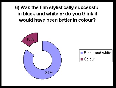
Analysing the results of our post-production questionnaire, we were pleased to see we had successfully reached a perfectly balanced proportion of each age demographic and an almost perfect balance of male/female ratio. 88% felt that our film title ‘The Lover Who Lied’ was a completely appropriate film title, which for us is a huge success. Only 3% of participants believed it was poor or terrible, with the remaining 9% considering it to be average. However, less obviously successful were the results in response to how successfully our participants thought we had made a student film. 3% believed it was poor or terrible, 9% average and 88% believed it was either good or very successful, with the highest proportion of responses being “very successful”. We are pleased with this result considering the subjectivity in appreciating film as well as the technical difficulties we encountered. However 9% believed our film was not recognisable in its intended era of America in the 1940s. Although this is comparable to 58% answering maybe and 33% responding with “yes”, it is still an element we need to consider more carefully next time in conveying the context of the film to our audience. Much of it may have been missed in the unclear dialogue. We were interested to see that while 84% agreed with our stylistic decision to use black and white, a significant 16% of participants believed it would have been more successful in colour. We interested to find these responses supported with reasons such as it would be more attractive, more geared for a modern audience and even more expressive, flagging up the potential for loss of meaning or feeling in the absence of colour filming. This audience feedback has made us consider the potential for a “film noir” in all but colour, and its possible power as a genre or new subcategory of neo-noir.
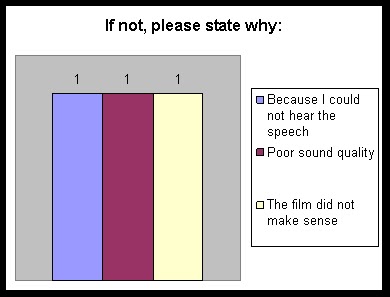
Almost all of our audience, an impressive 98%, considered “The Lover Who Lied” to be a successful tribute to film noir and 97% as a successful short film which we felt this to be a massive compliment. Of the 2% who did not believe it to be a successful tribute, it was important for us to discover why and both participants answered that the sound quality ruined the success of the film. Of the 3% who did not feel “The Lover Who Lied” was a successful short film, 2% blamed sound quality and 1% said the film made no sense, which again could possibly be blamed on the sound. While frustrating, it highlights the integral value of sound quality to appreciating and understanding film.
95% found our film to be engaging, with reasons such as the aesthetics, the cinematography, and most highly attributed the music and the “good plot with a twist” as the reasons why. The reasons which acted against the films engagement were the dialogue, the difficulty in understanding the plot and the fact it was not long enough to fully express the story. This feedback has made us consider scaling back our plot complexity and the ambitiousness of our story in a short film next time for simpler, cleaner and more ingenious concepts.
100% felt we cast our characters well so we have no doubts about the actors we managed to used, and realised that this element of film is such an important one in the professionalism and zest of a short film. Of the other elements rated in the questionnaire, most often rated successful were cinematography (100%) lighting (97%) editing (99%) and mise-en-scene (98%.) These visual elements were the most successfully received. The poorest received, as we expected, was the dialogue, with only 80% believing this was a good aspect of our film, perhaps only because of the music choices.
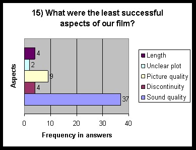
However, in numerical ratings, the highest scored element were actually the costumes out of 10, achieving 498 out of 500, seconded by set design (482) and followed by editing, with 470. The lowest rated was of course sound quality, with 212 out of 500, and actually then titles/credits, scoring 330 out of 500. We were surprised by this but considered that because of our simplistic and some difficulties we encountered in the positioning of the credit text at the end of our film, they didn’t end up looking as polished as we may have hoped. However they were still generally quite well received.
We were very much surprised with the result that 82% wanted to see a remake or a sequel to “The Lover Who Lied” with 11% responding with “maybe” indicating that, despite its flaws, overall our audience genuinely liked the film, saw its potential or wanted to see more. This has taught us that the overall impression of the film has been positive and interested despite the less than perfect feedback on some of its micro-elements.
With regard to the uniformity of our three products, the film, the poster and the magazine review, there were mixed reviews of the elements which tied our project together. 64% believed the colour scheme cohered well between the three, which is an average response and made us question some of our decisions to use unconventional approaches in a modern take on noir. We have realised that perhaps what we viewed would be most appropriate for noir in a magazine (striking, bold, white, black and red) compared to noir in a poster (muted colours, “modern” black and white) compared to a film noir (true monochrome) didn’t actually manage to match up stylistically, and we should have introduced some more uniformity in the colour scheme either with “muted” colours or stay true to the monochrome theme in all three products.
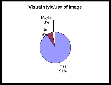
However our use of visual style was well received with regards to uniformity, with 91% responding that our photography correctly matched and successfully corresponded with each other in all three products, which is what we expected when we conducted the stills photography to emulate the film’s cinematography.
Our audience feedback reflected some inconsistency in the layout of our three products, whereby only 68% believed they cohered well. As the layout of the poster and the magazine article are the main products to be considered here, we have acknowledged that we were indeed pressed for time in the creation of these two ancillary products and perhaps did not layout the products successively with a view to the two combining successfully. Our use of language was more successfully received, with 72% believing it to be successful and the rest responding with “maybe.” A possible area of improvement would be to employ more powerful and high-impact language on both the poster and sensationalist, critic’s language on the review to more clearly convey the short noir film genre we wanted to express in all three products.
Overall we received lukewarm, positive feedback regarding the support and representation of the main product by the two sub-products, with 52% responding with “effectively” and 42% with “quite well” with the main given reason being that you could tell the genre of the film in all three products, and they complimented each other well, targeting our audience well. Only 6% felt that they were not effectively supporting “The Lover Who Lied” or not at all, supporting their responses with the comment that they could have been made to look more similar to one another.
The success of our three products overall was rated at excellent by 48% of our audience, and good by 45%. 6% rated it average, for reasons we assume already detailed in the earlier responses regarding sound quality, colour schemes, layouts and understanding our plot, and only one participant believed our products were poor overall.
To conclude, as this audience feedback has shaped our views on the successes and flaws in our project hugely, we believed that by and large our participants appreciated the look of our film and our images in the sub-products. They felt that our products cohered relatively well with some areas for improvement, and that the success of our film was largely impaired by the poor sound quality in our restaurant dialogue, affecting the enjoyment and understanding of the film for some. However, our audience wanted to see more; they were engaged, wanted to see more of our story with a sequel or an extended version, and saw its potential and wanted to see a version with better audio. We were pleasantly surprised with how much our audience understood what we were trying to create and convey in our products, and how open the younger demographic were to receiving such a classic, vintage genre.
Evaluation - part 2
The combination of our main and ancillary products is largely successful with some potential for improvement. The overall reason for this is down to the key features which link the three products; although the film poster is in colour, the colour scheme is pared down and minimal with the two main colours being black and white, reflecting the film's black and white aesthetic, with a small inclusion of red on details such as the colour of her lips - a very effective tool in connoting her dangerous and seductive character features, enhancing the audiences impression of her character. The magazine review of the "The Lover Who Lied" is similarly designed in terms of colour, with a black and white basis with the background and the text and colour images of the actors, although featuring far more red as a layout feature. The mainly united colour scheme is effective but when comparing the three products the double page spread definitely should feature less 'red' to regain the pared down, stylised cool with little or no colour to represent the film better. Also, the poster would appear more effective if the pink tone to Frank's headshot on the lower left of the poster was lowered to cohere with the skin tone of the others and improve the co-ordination of colour in the product.
However, the poster represents the film well with its simple concept of featuring the main focus of the audience's attention in the film - our femme fatale, Rita, with two minor head shots to the left to represent her two male love interests. Perhaps the poster would be more congruous to the film if the layout showed that Jim was, however, the male protagonist and far more important to the audience than Frank, by using a larger headshot of Jim maybe peering over her shoulder to represent the narrative role he plays. I think the layout of Rita almost stepping on the film title "The Lover Who Lied" symbolises her dominance and ruthlessness in the film well, and the inclusion of the cigarette she is smoking and the fedora Jim is wearing as film noir codes tells the audience a lot about what genre of film this is. The layout of the magazine article, where Jim appears in a large image on the left of the article and an image of Rita mirrors this on the right, is successful in depicting the tense relationship and oppositional dynamic between the characters in the film, and is very for a Hollywood film poster like "Mr & Mrs Smith" however could be improved by use of an image reflecting the classic nature of their relationship in a more passionate pose together. Also I feel that the review would have represented the film better had the choice of images been screenshots from the actual film footage rather than promotional shots, given the audience more of an insight into the truly colourless noir style of The Lover Who Lied.
The recurring typeface in all three tasks is an effective convention in signalling all three products, and its jazzy, slick and highly stylised connotations not only alert the audience to the visual style, tone and setting of the film, but that all three are linked. I feel this is especially successful between the poster and film, as using the same typeface of the title sequence as in the title on the poster is a classic convention to thematically enjoin the two. The reason I feel this is less successful in the movie review is due to the fact that film articles do not usually represent the film using typeface, as they would prefer to use the uniform typefaces of the publication, but represent it in other ways such as image, colour scheme, language and layout.
In summary I feel that The Lover Who Lied, the film poster and the magazine article do successfully interlink with one another and the two ancillary tasks do effectively communicate with the audience the themes of crime, corruption, seduction and moral degeneration, the mysterious style and the genre of film, but could do more to represent its more classic, vintage era we depict and the darker, more shadowy world we created with less use of high key colour images and more screenshots of the film in the review.

Evaluation - part 1
The Lover Who Lied encapsulates the classic noir essence we were aiming for and makes use of many of its conventions. In a few aspects we develop these conventions, but due to the nature and intention of our film challenged few; our idea was to pay tribute to and emulate the style of film noir. We understood that in taking on such a genre, visually our film would be unconventional in normal, modern Hollywood terms.
Regarding mise-en-scene, our use of colour was classically black and white, perhaps one of the most instantly recognisable features of noir. During filming, our use of the two portable lamps to create hard light and crisp shadows served us well to achieve that low-key, dramatic effect. Also to enhance its look of authenticity, the use of contrast and depth of black was enhanced in Final Cut Pro for that look of extra hard light we have seen in all of the other noir films we researched. Finally in editing we used the Final Cut Pro software to especially enhance the red colours in the film before we converted it to black and white, to achieve a further effect of drama, glamour and mystery so synonymous with film noir. We also made sure to utilise any street-lights we came across in shooting our outside scenes, as its extreme, distorted or silhouetted look was exactly the effect we’d seen in other noir films. Shots where use of these techniques are especially effective can be seen below in the following screen-shots.
As explained in our planning process, we identified the male costume conventions for forties’ film noir and followed them as meticulously as we could; loosely tailored suits – usually a lighter colour as opposed to black – black smart shoes, shirts and ties and most notably the fedora hats. It was crucial we included a fedora hat in the costume of our male protagonist Jim, as they are a key code in film noir and are an instantly identifiable as a integral part of a film noir costume. Their connotations of mystery, crime, moral corruption and cynicism were perfect for the role of Jim as a detective. His clean-shaven face and handsome good looks were exactly what we felt the role required to make the film believable and engaging, as we knew that noir was still a by-product of Hollywood and glamour was injected wherever possible. The male waiter was conventionally wearing a traditional shirt, tie, black trousers and apron, his simpler attire connoting his minor role.
However in terms of casting Frank, Rita’s husband, we decided to develop the convention of costume in his case as we wanted to create a distinctly separate look. So as to make it perfectly clear to our audience he was a husband since the narrative did not explicitly explain this fact, we opted to cast male actor Henry with longer hair and a beard to show an older age and serve as a physical contrast to Jim. We also cast him in trousers, shirt, tie and a jumper to suggest his more domesticated role as he waited for his wife to come home. Such a deviation from the noir uniform for men was with good reason. We felt that conventionally in noir the characters looked very similar in costume and we did not want to leave our audience in any doubt that Frank was another man, and with him not being in a suit, we felt it was effective to contrast Jim’s younger, sharp cynicism and Frank’s cuckolded, unsuspecting role through costume.
We identified that the femme fatale in all of the films we researched is cast as an attractive, mature woman, as opposed to the film starlets we see today in both indie films and Hollywood in their early twenties. Even though our actress for Rita was only 24, she had a bold, striking and sophisticated look which matched the requirement exactly. We managed to age our actress slightly with the use of make-up to fit a conventional femme fatale. The conventional noir costume of rollered, clipped-up hair, heavy matte make-up, and glamorous outfits showing off the starlet’s curves we followed exactly, as we believed this was the most important costume to get right and have it looking authentic. However I feel we progressed the convention as instead of having Rita in a sparkling long gown or a strapless dress, we conveyed Rita as more ambitious, independent and headstrong by power-dressing her in a long pencil skirt and a voluminous, sheer and ruffled white blouse – perfect for creating the classic hourglass figure we see in film noir – with the noir staples of stockings and high heels. This more business-like outfit was still seductive but conveyed her characteristics more successfully to a modern audience than a woman in a ball-gown, while remaining firmly in the era of forties fashion. The headpiece with the veil over her face connotes secrets or a deceptive nature, and the fur coat, white gloves and clutch bag inform the audience of her vanity and need for material possessions.
Every single prop we included on the set of The Lover Who Lied was to keep the film looking authentic, inform the audience about the character using the prop or suggest to the audience something about the location the film was set in. We knew that cigarettes were notoriously featured in film noir due to their connotations of vice, sin, addiction and mystery, however Jonathon James (playing Jim) did not want to smoke and the chances of getting permission to smoke in restaurant were slim. However, the inclusion of Rita smoking as she walks through the suburban streets and stubbing out the cigarette before entering the restaurant I feel is very evocative, symbolic, and of course important in including another code of film noir.
Film noir is often known for it’s seediness and decadence, so the inclusion of Jim brooding over a brandy glass in the restaurant again is a conventional device to suggest a tormented character and a troubled state of mind. Conversely, Rita’s martini cocktail suggests glamour and sophistication combined with a vapid personality – how so many noir femme fatales are portrayed. Her ill-fitting wedding ring and her struggle to put it on suggests to the audience that she is not marriage material, and that she wrestles with her identity as a wife. The love-note which falls form Rita’s coat pocket onto the floor symbolises how she treats love as a disposable commodity, while the watch on Jim’s wrist suggests he is a shrewd and observant man. His wad of American banknotes, and the casual manner with which he throws them down on the table, is suggestive of his disillusionment with the world and its corruption. The two mirrors into which we see Rita peering signify vanity, leading a double-life and the desire to question what she really wants. In the noir films we have researched, other than meaning, props are also used to create a sense of opulence and style to offer their audiences some form of escapism. Other than these key props, the rest, along with the set design, such as the gilt-framed pictures on the wall in the restaurant, the bottles behind the bar and the candlesticks on the mantelpiece are included to do just that; create an aesthetic of glamour and elegance for our audience to enjoy.
We had seen tense scenes of conversation unfold amidst a public background setting in noir films before, with the ambient diegetic sound to demonstrate this, and this was the obvious way to depict our own scene between Jim and Rita. The background sound of cutlery, customers and coffee being made was an effective filmmaker’s technique to enhance the realism of the scene. Enhanced sound was used to create drama, seen when the note was dropped on the floor, when Rita smashes her cocktail glass or when Jim bangs his glass down on the table.
A combination of diegetic and non-diegetic music used in the film is also a convention of film noir; where often you will hear a off-screen sweeping score in certain scenes or hear a big band playing in a nightclub in another. We decided to use this ourselves and in the external sequences we added a non-diegetic jazzy, double-bass piece of music to set the uncertain, mysterious and slick tone and give the sequences some pace, which we repeated at the end as well as at the beginning to give the film a sense of conclusion, whilst still connoting mystery and the unresolved. While in the restaurant we added some big-band swing style music in the background for a truly conventional sound. This music has classically glamorous, sophisticated and romantic connotations, which as the scene progresses takes shape as contrapuntal sound, as it did not reflect the tension and subsequent split between Rita and Jim. This use of contrapuntal sound is a common convention often used to emphasise the contrasting mood in the scene, and functions effectively in our film. The restaurant music was intended to be diegetic, but we played with this convention by adjusting the volume to quiet to emphasise a certain line, or to louder to heighten the drama in a certain shot. In this sense we developed convention to create meaning and suit the needs of our film.
The use of the narrative voice-over is a clear code in film noir and supports the structure of a noir film; introducing the audience to the protagonist and setting the film in context. We borrowed this convention ourselves as it was crucial to the coherence and significance of the film – our audience would know who to relate to and be given clues as to why the two were meeting. We developed the convention slightly by adding a distorted effect to hide some flaws with the recording, but felt that the style was similar to a telephone call or a two-way radio, which is a conventional concept seen in a telephone confession used as a voice-over in Double Indemnity.
Many conventional devices were used in the cinematography and editing of The Lover Who Lied. The use of the over-the shoulder shot in combination with the shot–reverse-shot editing technique over the dinner table was highly conventional and the most effective way we could draw our audience into the conversation. This was achieved successfully with the use of two cameras to film each character for a portion of the script, and then using the audio from only one of the cameras. It was tricky to edit but we felt worth it due to its natural and conventional result. We noticed that in most of the other films we had seen, the camera does not stay on each character as they say their line but goes to the listening party, when their response is important or to show they are absorbing what the other is saying. We decided to utilise this in our own film.
The use of a slightly lower angle to suggest when either Jim or Rita has assumed a more dominant role in the power balance of their meeting is a well-known trick, and a higher angle to suggest when Rita is having to defend herself or is being placed under scrutiny by Jim. We were careful to use an establishing shot for the exterior of the restaurant, to again give the audience a sense of location, and wanted to use one for the city in which the film was set but wasn’t possible to film. There are examples of eye-line match, such as when Jim notices Rita first entering the room, which alerts the viewer to a significant moment, and also being a long shot gives the audience a sense of spatiality within the restaurant. There are examples of reactionary close-ups placing importance on that character’s thoughts and feelings, and of extreme close-ups showing the audience an enlarged view of any crucial details, such as Jim picking the note up from the floor, sliding it across the table to Rita, the cigarette being stubbed out beneath Rita’s shoe and the smashing cocktail glass on the floor. These are all instances of close-ups being used conventionally to create meaning. Match-on-action sequences in combination with point-of-view shots are also used, like when Jim checks his watch or Rita opens the bathroom door, for continuity and for the audience to really feel within the scene and with the character. Long two shots are used intermittently as a technique to remind the audience of the overall dynamic between Rita and Jim, as they are able to compare their body language and see them both at the same time. However when Rita stands in this two-shot, the camera follows her instead of staying with Jim, showing to the audience that at this moment in time she has the upper hand power-wise.
While filming the two shots of the house, we shot in a voyeuristic style which allowed the audience to see into the living room. This conventional and common technique lent the scene a sense of Rita’s guilt and deceit whilst suggesting we were looking in on a private and intimate scene. The framing of the closer shot, where the audience see Rita and Frank in an embrace framed in between a lamp and the window frame, is suggestive of her sense of imprisonment within the confines of married life. In filming the opening sequence, continuity was ensured by checking the choice of shots that Rita was always walking in one continual direction, by reversing and flipping certain parts in editing. A variety of distorted angles and shot types were used, an interesting feature of film noir, such as the extreme high angles looking down on the street or down the alleyway stairs and an extreme low angle looking up at Rita. This was enhanced further in editing by playing with the angles of the shot to distort them further in Final Cut. This variety of shots suggested that wherever she walked, she was being watched from somewhere, and this effect was exaggerated by the camera lingering awhile when she walked out of shot. The high angles connoted the distinctive evil omnipresence looming over the typical “noir” city. The fast-paced editing gave the walking sequence the same sense of paranoia and imminent danger that all of our researched films were infused with.
Subscribe to:
Posts (Atom)